Many scientists and mathematicians believe that stock prices move in fractal patterns. An excellent book on this subject is The Misbehavior of Markets: A Fractal View of Financial Turbulence by Benoit Mandelbrot.
Mandelbrot describes the Fractal Dimension Index (FDI) as a way to measure “how convoluted and irregular” something is. And the FDI can be used as a stock market indicator. If you use TradeStation, you can download my FDI indicator (see below).
We can look at prices in a market as “trending” or “ranging”. During a strong rally, prices trend sharply, sometimes approaching a one-dimensional straight line. And if we believe that prices should move in a more jagged fractal pattern, we would assume that the almost-straight movement will end at a point which we might be able to predict with a degree of accuracy sufficient to make a good trade.
After trending, prices often trade in a range for a while before embarking upon the next trend. Imagine prices trading in a rectangular pattern, zigzagging back-and-forth over the same points in a two-dimensional planar pattern. A plane isn’t a fractal any more than is a straight line, so we might expect prices to break out of the range and get back to acting like a fractal.
And so, the FDI is a method which assigns a number to the line on your chart. The number will be between 1.0 and 2.0. The closer prices move in a one-dimensional straight line, the closer the FDI moves to 1.0. The more closely prices resemble a two-dimensional plane, the closer the FDI moves to 2.0.
A trend causes the FDI to move down, and we can expect the trend to end when the FDI reaches the 1.35 level. The FDI does not tell us if the trend will reverse sharply, or if prices will begin to range. It only tells us that prices should go back to acting like a fractal soon.
As the market ranges, the FDI will move up. When the FDI reaches the 1.55 level, we can expect a new trend to begin. The FDI does not tell us which way prices will break, only that a break should be coming soon. Let’s look at some examples.
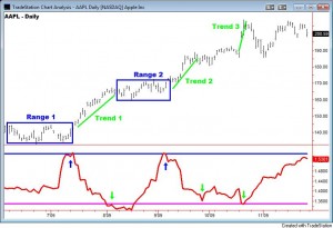
Here is a daily Apple (AAPL) chart from June to November 2009. The Fractal Dimension Index is the red line at the bottom. (click chart to enlarge):
Coming into July 2009, Apple was in a trading range. See the blue box marked “Range 1” on the chart. Notice how the FDI moved up to the 1.55 level, marked by the blue horizontal line, and signaled that a new trend was likely to begin soon. And so it did. Trend 1 moved upward until the FDI dropped to the 1.35 level marked by the purple line, and signaled that the trend was likely to end soon.
Apple then began ranging again (Range 2) until the FDI moved back up to the 1.55 level. That signaled another trend, and Trend 3 began. The FDI dropped back toward the 1.35 level, but didn’t quite make it. Apple sort of drifted up some more until the short, sharp burst of Trend 3. The FDI hit 1.35 and the trend ended. Apple did not range for long enough between Trends 2 and 3 for the FDI to give an end-of-range signal.
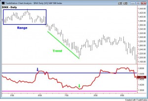
Here is a daily chart of the S&P 500 from May to September 2008 (click chart to enlarge):
The market had been ranging in the blue box throughout May, and the FDI gave the “end of range” signal at the end of the month (blue arrow). The range ended with a bang and the market trended downward until the FDI approached the 1.35 level (green arrow) and signaled that the trend was likely to end.
It’s important to note that the falling FDI on the first chart signaled the end of an uptrend, and on the second chart, it signaled the end of a downtrend (green arrows.) So, the same reading might be used to buy or sell depending upon the direction of the trend. A low FDI is not good or bad, but means “end of trend”. A high FDI means “end of range”.
Due to the “self similarity” of fractals, the FDI should be valuable on any time frame.
Fractal Dimension Index Indicator for TradeStationn
Different stocks, commodities, and markets will make varying extremes on the FDI. With my indicator, you can set the levels of the blue and purple lines to fit what you are trading. Just look at the extremes from the past, and adjust the lines to fit. My indicator also has customizable alarms. So, on a DIA chart, for example, you can enter: “Dow end of trend alert” and when prices cross the lower line, that is the message that TradeStation will give you. If you set TradeStation to give voice alarms, you will get a much more sensible message when your computer voice tries to pronounce it since “DIA” is not word.
If you like the FDI and use TradeStation, PayPal $50 to the address on the About Page, and I will send it to you.
Note: You can see another FDI example that I did on the weekly gold chart back here.
If you liked this page, then you will love my book: The General Theory of Day-Trading, which I think will prove to be a watershed in trading history. You might also be interested in my economics website The Daily Jobs Update where I track the national FICA/payroll-tax collections. The data is published daily, so it is an incredible, real-time, economic indicator.

