While elegantly designed, the height of the WordPress default header strikes many people as too tall. Here I describe the steps I took to reduce mine. If you are using a different theme, you will not be able to follow these exact steps, but the process will be very similar.
There are four things that you need to do:
- Edit your header image to be shorter.
- Reduce the size of your blog title.
- Reduce the padding of the title.
- Reduce the padding of the default header image.
The header of a WordPress blog consists of a background image, and then the blog title text drawn on top of the image. WordPress also draws a rectangle that can serve as the header background if it can’t download the header image for some reason. Normally, the image is downloaded to the browser okay, and then covers up the rectangle, but we need to tell WordPress to draw a shorter rectangle to match the new size of the image. The style specifications for these three elements are scattered around the functions.php and style.css files.
First, the header of this blog used to look like this (click to enlarge):
The first thing that I did was to use MS-Paint to reduce the size of the header image, kubrickheader.jpg, from 200 pixels tall to 100 pixels tall.
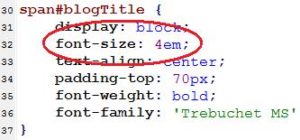
With the shorter image, the blog title text made things looked crowded, so I reduced its font size from 4em to 3em. This is done in the style.css file:
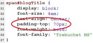
With a shorter image, I needed the title to print further up the page so that it would be centered in the image. To do that, I reduced the padding from 70px to 30px:
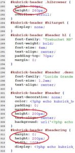
To tell WordPress to draw a shorter default rectangle-header, I went into functions.php, scrolled down to the the style tag and found the HTML elements that related to the header height. I then cut them in half to match the size of my new header image:
In that same section, I also reduced padding-top to 30px.
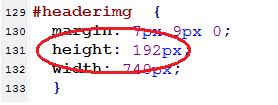
Next, in style.css, I cut the headerimg height value in half to 96:
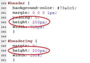
Further down in style.css, there are two more height elements that I also cut in half:
And finally, I reduced the font-size and padding-top values of “headerimg h1” to 3em and 30px:
Note: Header-6.jpg was lost when I copied this post over from the old Consulting site. But we aren’t going to publish this anyway.
If you have more than one style sheet, you will need to modify those too.
To see if the default rectangle is drawing correctly, rename your header image so that the browser won’t download it, and then force-refresh the page. In place of your header image, you should see a plain rectangle under your blog title.

